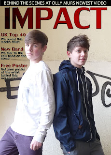
As you can see from the image above, in this particular section I added the information regarding other sections of the magazine. I went for simple things that would be expected in this genre of magazine. The difficult part for this particular section was trying to get the text so that it stood out on the page, while also fittting in with the colou pallet that I set out, which was black, white and red. I tried many different things and eventually I decided to add affects to the text so that it would stand out.

No comments:
Post a Comment