Tuesday 14 May 2013
Evaluation-Question 4 - Who would be the audience for your media product?
I feel that the audience for my magazine would be people aged between 18-22, although I feel it could still attract people of a slightly older age and people of a slightly younger age. I think that my magazine would probably be aimed at both genders, as with the magazine being based around chart music, it will appeal to both.
Evaluation-Question 2 - How does your media product represent particular social groups? (age/gender)
With the age range being 18-22, so late teens early twenties, I tried to represent that by using vibrant colours and making it as vibrant as possible throughout, in terms of the front cover, feature article and the contents page. As well as this I used model on the front cover who are young,, wearing young clothes and look quite fashionable and i feel that helps it appeal to that age range. However that doesn't mean to say that it wouldn't appeal to those of a younger age or older age but that is the main age range that I have gone for. In terms of gender both male and females, depending on who the feature article is about, would buy the magazine but I think that this particular magazine would appeal to both. Also the fact that the magazine is all about chart music allows it to appeal to both genders as this is a popular genre of music.
Evaluation-Question 1 - In what ways does your media product use, develop or challenge forms and conventions of real media products?
The media product that I have produced uses develops and challenges the
forms and conventions of a real media project in many different ways. I firstly
decided to decide on a suitable colour pallet that would work well with the
genre that I have chosen for the magazine, which is hip hop. I decided on red,
black and white, I did this because this is a common colour scheme for this
genre of magazine. I felt that the chosen colour pallet allowed for the
magazine to look very professional, as well as this I wanted the
magazine to be instantly recognisable to its target audience, as well as not
allowing the colours to clash but rather stand out on the page and I believe
that the colour pallet I chose allowed it to do just that.
When creating the front cover of the magazine I decided that I would follow the typical conventions of the structure and layouts of a front cover from a well-known music magazine, Billboard, the main reason was because I didn’t want the magazine to look cluttered and complicated. I felt that this was important because if I had have made the front cover look cluttered, the magazine may have been mistaken for another genre such as rock and Kerrang for example, because that is a typical convention of that genre of magazine. The font of the magazine is something that I also felt was important to the magazine, the font that I decided to use was LilyUPC, I chose this because it is very clear and it stood out on the page, I also felt that it was quite simplistic and fitted in perfectly with the genre of my magazine, this was a convention that I followed all the way through my magazine, so that it looked professional and it all flowed properly. I put all of the important information regarding features within the magazine down the left hand side of the front cover and then the important information regarding the feature article over the top of the main image in the centre of the page, I did this in a larger font size because this is the main feature of the magazine so it needs to stand out on the front cover otherwise people may not buy the magazine. Something where I feel that I didn’t follow the typical conventions of a music magazine was with the image that I used, I decided that I would go for a fully body shot of the two artist that would appear in my feature article, this is instead of the typical convention of using a close up shots of them both. I felt that this worked better because of the fact that the feature article is about two artists instead of one, if I had decided to do it about one person I would have done a close-up shot in order to fill the front cover but as I decided to do a two artist feature article, it would have been impossible to fit two close up shots of them both on the front cover. I wanted to do this because it allows the audience to see the mise en scene of costumes that the two artists are wearing, as I feel that this is important to show the genre of the magazine further. The artists are posing together and are both looking towards the camera, which not only forms a personal relationship with each other but also provides a direct address to the audience, providing a reason for them to buy the magazine. Again this is a typical convention of this genre of music magazine and is also apparent on the style model that I used which was Billboard. Billboard has a very unique style and although I did take ideas from the magazine, I didn’t want to copy the style as it is very unique to that particular magazine. I feel that my magazine is quite traditional in regards to the layout and its simplicity. One thing that I decided not to do, even though it was on all of the style models that I looked at, was not to allow for the artists on the front cover to cover the masthead, the reason for this is because magazines such as Billboard and Kerrang can do this because they are well known, whereas my magazine will not be known to its audience yet. The final convention that I followed was to put the artist’s information in red and the text regarding the artist in white, this was so the artists name would stand out on the shelf in a shop surrounded by other magazines of a similar genre; this is something that again flows throughout the magazine, which reinforces my house style. I found the contents page the most difficult part of the project; it was inspired by a few different magazines such as Billboard, NME and Vibe. With the images I decided to go for three medium shots as this is a common feature on magazine contents pages rather than have a full image of just one person, using the medium shot allows me to have three images on the contents page. For this however I challenged the convention of direct address to the audience as none of the three artists are actually looking directly at the audience. I did this to create a little bit of mystery surrounding the artists on the page. Things on the contents page such as ‘features’ etc. are all things that I used from looking at my style model which was NME, as well as the ‘IMPACT this week’ coming from that magazine as well. I decided that I would put the important information such as artist names in different colours to the rest of the text.
When creating the front cover of the magazine I decided that I would follow the typical conventions of the structure and layouts of a front cover from a well-known music magazine, Billboard, the main reason was because I didn’t want the magazine to look cluttered and complicated. I felt that this was important because if I had have made the front cover look cluttered, the magazine may have been mistaken for another genre such as rock and Kerrang for example, because that is a typical convention of that genre of magazine. The font of the magazine is something that I also felt was important to the magazine, the font that I decided to use was LilyUPC, I chose this because it is very clear and it stood out on the page, I also felt that it was quite simplistic and fitted in perfectly with the genre of my magazine, this was a convention that I followed all the way through my magazine, so that it looked professional and it all flowed properly. I put all of the important information regarding features within the magazine down the left hand side of the front cover and then the important information regarding the feature article over the top of the main image in the centre of the page, I did this in a larger font size because this is the main feature of the magazine so it needs to stand out on the front cover otherwise people may not buy the magazine. Something where I feel that I didn’t follow the typical conventions of a music magazine was with the image that I used, I decided that I would go for a fully body shot of the two artist that would appear in my feature article, this is instead of the typical convention of using a close up shots of them both. I felt that this worked better because of the fact that the feature article is about two artists instead of one, if I had decided to do it about one person I would have done a close-up shot in order to fill the front cover but as I decided to do a two artist feature article, it would have been impossible to fit two close up shots of them both on the front cover. I wanted to do this because it allows the audience to see the mise en scene of costumes that the two artists are wearing, as I feel that this is important to show the genre of the magazine further. The artists are posing together and are both looking towards the camera, which not only forms a personal relationship with each other but also provides a direct address to the audience, providing a reason for them to buy the magazine. Again this is a typical convention of this genre of music magazine and is also apparent on the style model that I used which was Billboard. Billboard has a very unique style and although I did take ideas from the magazine, I didn’t want to copy the style as it is very unique to that particular magazine. I feel that my magazine is quite traditional in regards to the layout and its simplicity. One thing that I decided not to do, even though it was on all of the style models that I looked at, was not to allow for the artists on the front cover to cover the masthead, the reason for this is because magazines such as Billboard and Kerrang can do this because they are well known, whereas my magazine will not be known to its audience yet. The final convention that I followed was to put the artist’s information in red and the text regarding the artist in white, this was so the artists name would stand out on the shelf in a shop surrounded by other magazines of a similar genre; this is something that again flows throughout the magazine, which reinforces my house style. I found the contents page the most difficult part of the project; it was inspired by a few different magazines such as Billboard, NME and Vibe. With the images I decided to go for three medium shots as this is a common feature on magazine contents pages rather than have a full image of just one person, using the medium shot allows me to have three images on the contents page. For this however I challenged the convention of direct address to the audience as none of the three artists are actually looking directly at the audience. I did this to create a little bit of mystery surrounding the artists on the page. Things on the contents page such as ‘features’ etc. are all things that I used from looking at my style model which was NME, as well as the ‘IMPACT this week’ coming from that magazine as well. I decided that I would put the important information such as artist names in different colours to the rest of the text.
I decided to do the feature article as two double page
spreads, one double page focusing on one artist and the other focusing on the
other artist. I did both of these in the same style to each other so that they
flowed well. I followed the conventional layout of any normal music magazine,
but the style model that I used was Vibe for my feature article. I structured
the piece as a Q&A which may not be conventional but I felt that it worked
well with the type of feature article that I was hoping to create. I also
decided to pull quotes out of the text and make them a feature on the page so
that people would flick to the page in the shop, see the quotes and then
hopefully buy the magazine. I also decided to have an image dominating a page
as I felt that this would allow the artist to stand out.
Contents Page - Preliminary Task (Repost)

Front Cover - Preliminary Task (Repost)

This is the finished front cover of my school magazine called The Weekly Granger, that i completed as part of a media project, i also created a contents page. On the front cover i have used all the same font, with the same effects on all of the lettering, and these were drop shadow, bevel and emboss and stroke, i used these in order to make the words stand out better on the page. For the background i used yellow and blue fading into each other because these are the school colours as shown on the logo, this means that the magazine sticks with the basic conventions of the school, to make it easily recognisable. I also used various pictures on the front cover and these were out of a selection of photos that i took, i then chose the best four of the ones taken to put onto my front cover. When choosing the photos i thought it was very important for the main image to be a picture of the front of the school, so everybody would know that this is the school magazine for Heworth Grange.
Wednesday 1 May 2013


Feature Article Progress #7

Feature Article Progress #6

I have now put the text onto my feature article and now all that is left to do is find a way to get rid of the white space that is left on the page.
Feature Article Progress #5

This is the first stage of the second part of my feature article. I have selected an image and layed the page out in the same way that I did the first section.
Feature Article Progress #4

This is the first section of the feature article finished, I have put the rest of the text on as well as a quote from the text. I have also decided to put the red bars along the top and bottom of the page, to get rid of the white space, and I have also put the page number on, which links to the contents.
Feature Article Progress #3

This section of the feature article is now starting to take shape. I have now Inputted some of the text, I have decided to put the questions in red and the answers in black italic, so that it is clear to the reader what section they are reading.
Feature Article Prgress #2
This is the latest stage of my feature article. I have put in the image of the artist that this section focuses in on and also included the introduction at the top of the page.
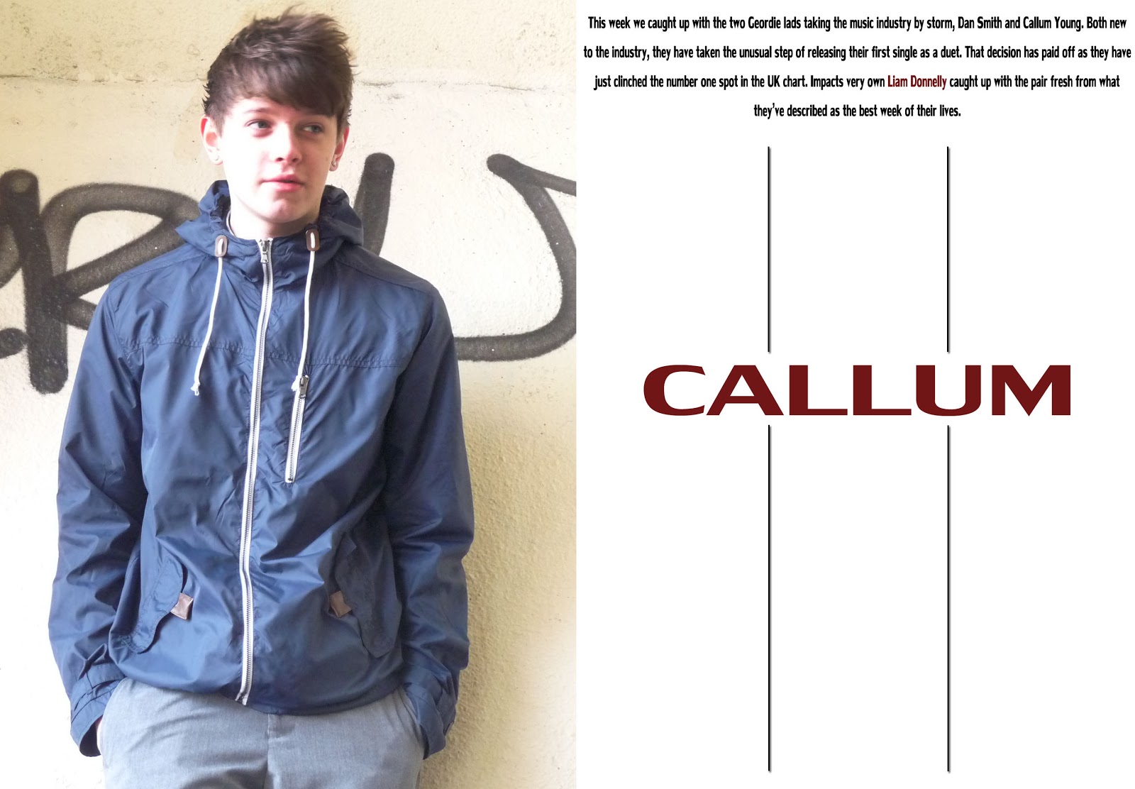
Feature Article Progress #1

I have decided to split the feature article into two, so one will be centred around Callum while the other will be centred around Dan. In the image above I have split the page up so that I have 6 columns for the actual article to go. I have again stuck with the colour pallet that I used on the front cover.
Contents Progress #4

This is my final magazine contents page. All that was really left to do was put in all of the information linking to the different features in the magazine.
Contents Progress #3

I have now placed the larger image above the other two images. I have done this so that the whole magazine does not come across as only being about two people. I decided to put a "luminosity" effect on this image, as I felt it looked and worked better this way rather than having all of the images being the same style. I have also decided to split the contents into two halves, with the bottom half being about the feature article and the top half being about all the other features that will be present in the magazine.
Contents Progress #2

I have decided to put an information bar along the bottom of the contents which tells the reader what edition it is. As well as this i have also put on the two images of the people that will be in my feature article. I have decided to put them at the bottom of the contents becuase I plan on having another, larger, image placed above it.
Contents Progres #1

This is the first stage of creating the contents page. I have decided on the background colour as well as the colour of the title, I have chosen these colours because they match in with the colour pallet that I have used on my front cover.
Subscribe to:
Posts (Atom)