Monday 2 December 2013
Documentary Update
Today myself and my project partner travelled over to the ground to take pictures for the poster that goes alongside the documentary.
Monday 25 November 2013
Voice-over Script
This is the script for the voice-over that myself and my project partner have written. This will be used in the documentary to provide information and a backdrop to the documentary.
Today we’ll be looking into one of
England’s biggest clubs, the sleeping giant of the Premier League- Newcastle
United or as known in these parts ‘THE TOON”.
The iconic black and white stripes donned by many over the decades and
all worshipped by the supporters. Some of the most fanatical in the land. The
club was founded in 1892 after a merge between Newcastle East and West formed
Newcastle United, and they haven’t looked back since.
St James Park, the sixth largest football stadium in the
United Kingdom. Smack bang in the heart of Newcastle. The focal point across
the city. Standing tall and proud in all
of its 52,387 capacity. Not only does it
host Barclay's Premier League games it’s was a venue for the 2012 Olympic
Football. We spoke to Joe Allon, a local lad who fulfilled his dreams and had the privilege of donning that iconic
number 9…
From Champions League to Championship
it’s never been an easy ride for Newcastle fans. From Keegan to Robson and the
shambles of Souness and Big Sam. Yet things have never seemed to look any
glummer than right now under the stewardship of Mike Ashley and his right hand
man- Joe Kinnear. There is fifty-two thousand passionate Geordie's striving for
a bit of silverware after over 40 years of ups and down, the roller coaster ride
of a typical Newcastle fan is set to continue. Steve Wraith shared this view on
Mike Ashley…
Times have changed, but it’s not all been bad. Newcastle
finished 5th two seasons ago and brought European nights back to St
James Park while the squad that got them there is still the same minus the sale
of Demba Ba, who the club would argue they have adequately replaced with Loic
Remy along with other successful buys. Whatever fans may argue there has been success under Mike
Ashley and as Neil Cameron explained, with a little bit more ambition, the club
could be right back up the league again…
Monday 18 November 2013
Response From OCR

This is the email we recieved from the OCR in response to our question, would it be possible to use YouTube footage in our documentary? We have been told that we will be able to use upto 30 seconds of footage.
Monday 11 November 2013
Watching Footage
This morning we have started to watch the footage back and are now choosing which sections to use. We will decide this by seeing who answered each question best and then using that piece of footage for the final documentary. This will help when it comes to editing the footage from next week on Final Cut.
Exterior Shots - Second Take
Today we went out and filmed the exterior shots of the stadium for a second time. We took similar shots to the last time we were out but tried to get a better quality shot. We also took some stills this time of things such as the Sir Bobby Robson statue etc. These will all come in handy when it comes to the final editing of the documentary.
Friday 8 November 2013
Interviewing Neil Cameron

On Wednesday we interviewed Neil Cameron from The Journal in what was our last piece of major filming that we needed to do. Again we asked him the same questions as both Steve and Joe but also got other useful bits of information that could be used. It was good to get a journalists perspective on the club, especially one who isn't from the region. As well as this the fact that we interviewed him just after the ban meant that it was perfect timing really.
Monday 4 November 2013
Emailing OCR
Today we have emailed OCR to inquire as to whether it will be possible for us to use some footage from YouTube of fan reaction to goals etc. in the documentary. We are awaiting a reply.
Screenshot of email to follow...
Friday 1 November 2013
Contacting Neil Cameron - Update
Today I have rang Neil Cameron to arrange the interview for the documentary. We agreed on Wednesday at 11:00 he would come into the school and we would shoot the interview from there.
Friday 25 October 2013
Interview With Joe Allon

Yesterday we interviewed Joe Allon, who is a former Newcastle United number 9. Joe came into the school and we arranged a meeting room and conducted the interview in there. We asked him a range of questions, as well as those we asked Steve Wraith, so that we could keep a consistent theme for the documentary. It was a very good interview and his answers came from a different perspective to Steves as he has played for the club, whereas Steve is speaking from a fans point of view. Again we managed to get aroud 40 minutes out of the interview which will help us again when trying to choose the best bits for the documentary.
Monday 21 October 2013
First Take of Exterior Shots
Today we went out and took our first lot of shots for the exterior of the stadium. We took a large number of these so we have plenty to choose from, as well as this we have taken them from different angles of the stadium to see which ones will work best in the documentary. These shots will act as transitions between scenes. On reflection we have found that out of the shots we have taken a few of them will work well, however we will need to retake a few shots.
Friday 18 October 2013
Contacting Joe Allon
On Wednesday we rang Joe Allon to arrange a date and time that we could interview him. It was arranged that he would come into school for 13:00 the following Wednesday.
Wednesday 16 October 2013
Contacting Neil Cameron

This is the email that I sent to Neil Cameron with regards to him taking part in the documentary. Neil works for NCJ Media (Evening Chronicle & The Journal). He agreed to taking part and said he would let me know with regards to date and time on Friday.
Tuesday 15 October 2013
Joe Allon
After we finished interviewing Steve Wraith, he gave us Joe Allons mobile number so we could contact him with regards to taking part in the documentary. Joe is a former Newcastle player who wore the famous number 9 shirt and played alongside greats like Kevin Keegan.
Interview With Steve Wraith

Monday 14 October 2013
Meeting Update
I have been in contact with Steve Wraith who is well known around Newcastle as being a fanatic Newcastle United fan. Steve is considered to be leaders of several supporter groups and has gave us the green light to interview him.
We will be interviewing Steve tomorrow morning at 10:00AM sharp.
We will be interviewing Steve tomorrow morning at 10:00AM sharp.
We will ask numerous questions to Steve about the state the club is in and other things such as how it is ran.
Meeting With Journalist
On Wednesday we went to meet a journalist from The Journal newspaper to discuss the possibility of him taking part in a short filmed interview for our documentary. It was a low key, informal meeting, where we explained to him the type of questions we would be asking him and how the interview would be structured. At the end of the meeting we handed him a copy of the questions, so he could clear it with his editor and we are now awaiting confirmation of his participation in the documentary.
Monday 7 October 2013
The Pitch
The typical conventions of a documentary
§
Voiceover: The voiceover in a documentary acts
as a commentary by the film maker; this will be heard over the top of the
actual filming. This allows the film maker to be able to speak directly to the
viewer, using it as a way to convey information.
§
Interviews: This is a common technique and is
used to add a sense of realism to the documentary.
§
Montage: A montage will usually be used as a
visual representation of the characters thoughts, and is used to help the
viewer better understand what the character is saying.
§
Archive material: There is a use of archive
material with things such as - stills, news, footage, newspaper headlines etc.
being used.
What we found out about the audience:I found out that the audience is quite niche and must be interested in not only football but also a keener interest in Newcastle United Football Club Ltd.
Description of ideas for products:
The documentary will be centred on Newcastle United and the recent history of the club over the past five years (the Mike Ashley era). It will show the struggles that fans have had to face over this time and how the club has been affected.
We will look to get face to face filmed interviews with top journalists from the region that cover the club. As well as this we are going to try and get one or two former players opinions, comparing how the club is now seen to how it was seen when they played.
We have also managed to get Steve Wraith, a fanzine editor, to take part in a short filmed interview. This will allow us to get an opinion of somebody who speaks on behalf of the fans as part of his job, and see what the general consensus is amongst the supporters, although we will also speak to supporters to get their opinions as well.
Why the product will be successful:
The product will provide an insight into Newcastle United
and will target those with an interest in the club and without this product
people would not be able to see this. It will show opinions of well-respected
people who are connected with the club and also certain fan base opinions.
Friday 4 October 2013
Analysis For Ancillary Task

This is a snippet of a synopsis for 'Educating Yorkshire' which I found in the Radio Times. Although what I will eventually produce will be more in depth than what is shown above I still think this could be something to bare in mind when it comes to my production of the ancillary task. The short questions give the reader exactly what it is they want to know, its straight to the point and provides an overview as to what the show is actually about, as well as where the viewer will find it being aired.
This is something that I would look to include in my ancillary task as a short overview of what the documentary is about etc. and then the larger text will give a more in depth look at what the viewer can expect.
Wednesday 2 October 2013
My Genre of Documentary
I will be producing a sports documentary that will center around Newcastle United Football Club.
Monday 30 September 2013
Planning - Documentarey Analysis (Mike Ashley)
The Mike Ashley documentary is made by the BBC and produced by Dan Farthing. It looks as Mike Ashleys time at Newcastle but also how he has made his millions. It centres around his life and includes a number of interviews, that are formal (to camera etc.). It is presented to camera but also with voiceovers as well. I thought that this would be a good one to look at because this is kind of what my documentarty is going to be based on so provided a perfect example of what to look at.
Target Audience
Now that it is getting to the stage of actually producing the product, I feel it would be best to look at who exactly the target audience for the documentary will be. I envisage the piece to be shown on a local news channel, as a sort of special report, as it is something that will be very much associated with people of the North East with it not really being something that would ever be shown nationally, as it would not gather enough interest. With this all being the case the target audience will be very niche as it will only appeal to those who firstly have an interest in football and secondly, those who have an interest in Newcastle United. The age range and gender is also something that would be very hard to narrow down as it is something that really comes solely down to interest and isn't like a music video where you could say that the target audience will be relatively young because of the type of song etc. meaning the overall I will just be aiming the product at those with an interest in the club.
Wednesday 25 September 2013
Morinho Documentary Analysis
This documentary focuses on Jose Morinho. It provides a very personal at his life and career.
The documentary shows the different ways to interview someone that I will look to use in my own documentary. Its a very relaxed set up and the questions that are asked cannot be heard, instead the viewer can only hear the responses which are given and I feel this is better as it gives the documentary more ebb and flow.
There are plenty of different interviews in the documentary but at no point is it a direct piece to camera as it is actually split up by different images and videos being shown over the top. It is broken up in a way that I feel will also suit my documentary.
Planning - Documentary Analysis (Stacey Dooley)

Tuesday 24 September 2013
Plannig - Documentary Analysis (Special Report)
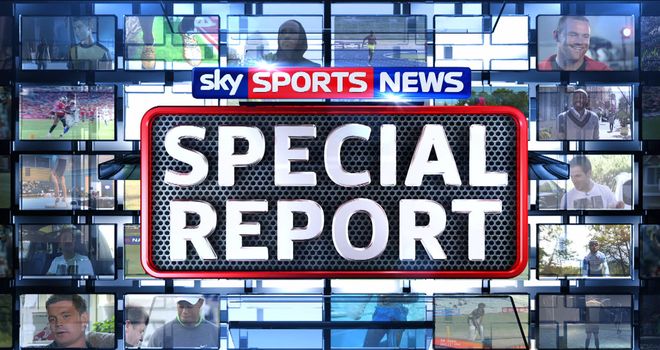
As part of my planning I watched a special report based on Cesc Fabregas, this was a short documentary that was presented by Georgie Thompson. It talked about Cescs life from his childhood right through to his move from Arsenal to Barcelona.
It provided many different ways of how to present a documentary with different features such as the voice over mixed with the actual presenting to camera. The piece was centred around Cesc and him talking about his life, it acted as an interview throughout however it was less than formal and the documentary came across as quite relaxed but very informative.
Monday 16 September 2013
Monday 1 July 2013
Contacting People For The Documentary
I have now contacted people from the local papers in regard to getting in touch with some of their journalists but have so far not had a response. As well as this I have also contacted the club but after hearing back from them I don't think there is a lot of likely hood of getting in touch with players that are still at the club as well as management. I have also contacted former players to see if they will take part in the documentary and I am awaiting their reply.
Plan For Next Year
Next year I am planning on creating a documentary for my A2 project. This will centre around Newcastle United and talk about the club from a fans perspective. I aim to get some well known people who are connected to the club to talk in the documentary. Ideally, I would like to get journalists who cover the club to answer question as well as former players and maybe even plkayers who play for the club now.
Tuesday 14 May 2013
Evaluation-Question 4 - Who would be the audience for your media product?
I feel that the audience for my magazine would be people aged between 18-22, although I feel it could still attract people of a slightly older age and people of a slightly younger age. I think that my magazine would probably be aimed at both genders, as with the magazine being based around chart music, it will appeal to both.
Evaluation-Question 2 - How does your media product represent particular social groups? (age/gender)
With the age range being 18-22, so late teens early twenties, I tried to represent that by using vibrant colours and making it as vibrant as possible throughout, in terms of the front cover, feature article and the contents page. As well as this I used model on the front cover who are young,, wearing young clothes and look quite fashionable and i feel that helps it appeal to that age range. However that doesn't mean to say that it wouldn't appeal to those of a younger age or older age but that is the main age range that I have gone for. In terms of gender both male and females, depending on who the feature article is about, would buy the magazine but I think that this particular magazine would appeal to both. Also the fact that the magazine is all about chart music allows it to appeal to both genders as this is a popular genre of music.
Evaluation-Question 1 - In what ways does your media product use, develop or challenge forms and conventions of real media products?
The media product that I have produced uses develops and challenges the
forms and conventions of a real media project in many different ways. I firstly
decided to decide on a suitable colour pallet that would work well with the
genre that I have chosen for the magazine, which is hip hop. I decided on red,
black and white, I did this because this is a common colour scheme for this
genre of magazine. I felt that the chosen colour pallet allowed for the
magazine to look very professional, as well as this I wanted the
magazine to be instantly recognisable to its target audience, as well as not
allowing the colours to clash but rather stand out on the page and I believe
that the colour pallet I chose allowed it to do just that.
When creating the front cover of the magazine I decided that I would follow the typical conventions of the structure and layouts of a front cover from a well-known music magazine, Billboard, the main reason was because I didn’t want the magazine to look cluttered and complicated. I felt that this was important because if I had have made the front cover look cluttered, the magazine may have been mistaken for another genre such as rock and Kerrang for example, because that is a typical convention of that genre of magazine. The font of the magazine is something that I also felt was important to the magazine, the font that I decided to use was LilyUPC, I chose this because it is very clear and it stood out on the page, I also felt that it was quite simplistic and fitted in perfectly with the genre of my magazine, this was a convention that I followed all the way through my magazine, so that it looked professional and it all flowed properly. I put all of the important information regarding features within the magazine down the left hand side of the front cover and then the important information regarding the feature article over the top of the main image in the centre of the page, I did this in a larger font size because this is the main feature of the magazine so it needs to stand out on the front cover otherwise people may not buy the magazine. Something where I feel that I didn’t follow the typical conventions of a music magazine was with the image that I used, I decided that I would go for a fully body shot of the two artist that would appear in my feature article, this is instead of the typical convention of using a close up shots of them both. I felt that this worked better because of the fact that the feature article is about two artists instead of one, if I had decided to do it about one person I would have done a close-up shot in order to fill the front cover but as I decided to do a two artist feature article, it would have been impossible to fit two close up shots of them both on the front cover. I wanted to do this because it allows the audience to see the mise en scene of costumes that the two artists are wearing, as I feel that this is important to show the genre of the magazine further. The artists are posing together and are both looking towards the camera, which not only forms a personal relationship with each other but also provides a direct address to the audience, providing a reason for them to buy the magazine. Again this is a typical convention of this genre of music magazine and is also apparent on the style model that I used which was Billboard. Billboard has a very unique style and although I did take ideas from the magazine, I didn’t want to copy the style as it is very unique to that particular magazine. I feel that my magazine is quite traditional in regards to the layout and its simplicity. One thing that I decided not to do, even though it was on all of the style models that I looked at, was not to allow for the artists on the front cover to cover the masthead, the reason for this is because magazines such as Billboard and Kerrang can do this because they are well known, whereas my magazine will not be known to its audience yet. The final convention that I followed was to put the artist’s information in red and the text regarding the artist in white, this was so the artists name would stand out on the shelf in a shop surrounded by other magazines of a similar genre; this is something that again flows throughout the magazine, which reinforces my house style. I found the contents page the most difficult part of the project; it was inspired by a few different magazines such as Billboard, NME and Vibe. With the images I decided to go for three medium shots as this is a common feature on magazine contents pages rather than have a full image of just one person, using the medium shot allows me to have three images on the contents page. For this however I challenged the convention of direct address to the audience as none of the three artists are actually looking directly at the audience. I did this to create a little bit of mystery surrounding the artists on the page. Things on the contents page such as ‘features’ etc. are all things that I used from looking at my style model which was NME, as well as the ‘IMPACT this week’ coming from that magazine as well. I decided that I would put the important information such as artist names in different colours to the rest of the text.
When creating the front cover of the magazine I decided that I would follow the typical conventions of the structure and layouts of a front cover from a well-known music magazine, Billboard, the main reason was because I didn’t want the magazine to look cluttered and complicated. I felt that this was important because if I had have made the front cover look cluttered, the magazine may have been mistaken for another genre such as rock and Kerrang for example, because that is a typical convention of that genre of magazine. The font of the magazine is something that I also felt was important to the magazine, the font that I decided to use was LilyUPC, I chose this because it is very clear and it stood out on the page, I also felt that it was quite simplistic and fitted in perfectly with the genre of my magazine, this was a convention that I followed all the way through my magazine, so that it looked professional and it all flowed properly. I put all of the important information regarding features within the magazine down the left hand side of the front cover and then the important information regarding the feature article over the top of the main image in the centre of the page, I did this in a larger font size because this is the main feature of the magazine so it needs to stand out on the front cover otherwise people may not buy the magazine. Something where I feel that I didn’t follow the typical conventions of a music magazine was with the image that I used, I decided that I would go for a fully body shot of the two artist that would appear in my feature article, this is instead of the typical convention of using a close up shots of them both. I felt that this worked better because of the fact that the feature article is about two artists instead of one, if I had decided to do it about one person I would have done a close-up shot in order to fill the front cover but as I decided to do a two artist feature article, it would have been impossible to fit two close up shots of them both on the front cover. I wanted to do this because it allows the audience to see the mise en scene of costumes that the two artists are wearing, as I feel that this is important to show the genre of the magazine further. The artists are posing together and are both looking towards the camera, which not only forms a personal relationship with each other but also provides a direct address to the audience, providing a reason for them to buy the magazine. Again this is a typical convention of this genre of music magazine and is also apparent on the style model that I used which was Billboard. Billboard has a very unique style and although I did take ideas from the magazine, I didn’t want to copy the style as it is very unique to that particular magazine. I feel that my magazine is quite traditional in regards to the layout and its simplicity. One thing that I decided not to do, even though it was on all of the style models that I looked at, was not to allow for the artists on the front cover to cover the masthead, the reason for this is because magazines such as Billboard and Kerrang can do this because they are well known, whereas my magazine will not be known to its audience yet. The final convention that I followed was to put the artist’s information in red and the text regarding the artist in white, this was so the artists name would stand out on the shelf in a shop surrounded by other magazines of a similar genre; this is something that again flows throughout the magazine, which reinforces my house style. I found the contents page the most difficult part of the project; it was inspired by a few different magazines such as Billboard, NME and Vibe. With the images I decided to go for three medium shots as this is a common feature on magazine contents pages rather than have a full image of just one person, using the medium shot allows me to have three images on the contents page. For this however I challenged the convention of direct address to the audience as none of the three artists are actually looking directly at the audience. I did this to create a little bit of mystery surrounding the artists on the page. Things on the contents page such as ‘features’ etc. are all things that I used from looking at my style model which was NME, as well as the ‘IMPACT this week’ coming from that magazine as well. I decided that I would put the important information such as artist names in different colours to the rest of the text.
I decided to do the feature article as two double page
spreads, one double page focusing on one artist and the other focusing on the
other artist. I did both of these in the same style to each other so that they
flowed well. I followed the conventional layout of any normal music magazine,
but the style model that I used was Vibe for my feature article. I structured
the piece as a Q&A which may not be conventional but I felt that it worked
well with the type of feature article that I was hoping to create. I also
decided to pull quotes out of the text and make them a feature on the page so
that people would flick to the page in the shop, see the quotes and then
hopefully buy the magazine. I also decided to have an image dominating a page
as I felt that this would allow the artist to stand out.
Contents Page - Preliminary Task (Repost)

Front Cover - Preliminary Task (Repost)

This is the finished front cover of my school magazine called The Weekly Granger, that i completed as part of a media project, i also created a contents page. On the front cover i have used all the same font, with the same effects on all of the lettering, and these were drop shadow, bevel and emboss and stroke, i used these in order to make the words stand out better on the page. For the background i used yellow and blue fading into each other because these are the school colours as shown on the logo, this means that the magazine sticks with the basic conventions of the school, to make it easily recognisable. I also used various pictures on the front cover and these were out of a selection of photos that i took, i then chose the best four of the ones taken to put onto my front cover. When choosing the photos i thought it was very important for the main image to be a picture of the front of the school, so everybody would know that this is the school magazine for Heworth Grange.
Wednesday 1 May 2013


Feature Article Progress #7

Feature Article Progress #6

I have now put the text onto my feature article and now all that is left to do is find a way to get rid of the white space that is left on the page.
Feature Article Progress #5

This is the first stage of the second part of my feature article. I have selected an image and layed the page out in the same way that I did the first section.
Feature Article Progress #4

This is the first section of the feature article finished, I have put the rest of the text on as well as a quote from the text. I have also decided to put the red bars along the top and bottom of the page, to get rid of the white space, and I have also put the page number on, which links to the contents.
Feature Article Progress #3

This section of the feature article is now starting to take shape. I have now Inputted some of the text, I have decided to put the questions in red and the answers in black italic, so that it is clear to the reader what section they are reading.
Feature Article Prgress #2
This is the latest stage of my feature article. I have put in the image of the artist that this section focuses in on and also included the introduction at the top of the page.
Feature Article Progress #1

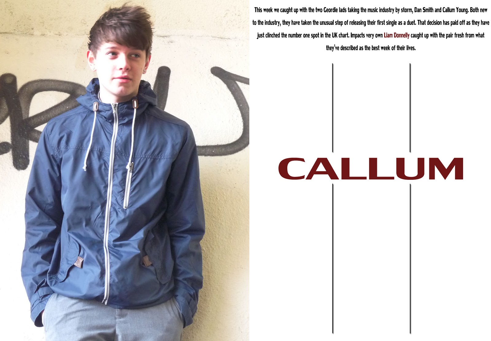
I have decided to split the feature article into two, so one will be centred around Callum while the other will be centred around Dan. In the image above I have split the page up so that I have 6 columns for the actual article to go. I have again stuck with the colour pallet that I used on the front cover.
Contents Progress #4

This is my final magazine contents page. All that was really left to do was put in all of the information linking to the different features in the magazine.
Contents Progress #3

I have now placed the larger image above the other two images. I have done this so that the whole magazine does not come across as only being about two people. I decided to put a "luminosity" effect on this image, as I felt it looked and worked better this way rather than having all of the images being the same style. I have also decided to split the contents into two halves, with the bottom half being about the feature article and the top half being about all the other features that will be present in the magazine.
Contents Progress #2

I have decided to put an information bar along the bottom of the contents which tells the reader what edition it is. As well as this i have also put on the two images of the people that will be in my feature article. I have decided to put them at the bottom of the contents becuase I plan on having another, larger, image placed above it.
Contents Progres #1

This is the first stage of creating the contents page. I have decided on the background colour as well as the colour of the title, I have chosen these colours because they match in with the colour pallet that I have used on my front cover.
Monday 29 April 2013
Evaluation
After the project deadline I will move onto constructing the evaluation of my project, which will consist of answering the questions shown in the previous post. This will need to be finished by 10th May.
Evaluation Questions
These are the questions that I will answer in the evaluation of my project:
1)
In what ways does your media product use,
develop or challenge forms and conventions of real media products?
2)
How does your media product represent particular
social groups? (age/gender)
3)
What kind of media institution might distribute
your media product and why?
4)
Who would be the audience for your media
product?
5)
How did you attract/ address your audience?
6)
What have you learnt about technologies from
the process of producing this product? Skills developed, strengths and
limitations
7)
Looking back at your preliminary task, what do
you feel you have learnt in the progression from it to the full product?
Project Deadline
The deadline for the project is the 30th April. My project is now nearly finished and I will be posting my finished pieces as well as the gradual progress that I made in the next couple of days.
Friday 19 April 2013
Project Progress
By the end of next week I hope to have the actual project finished, so that I am then able to concentrate on the evaluation. That means that I need to finish the feature article, which is near to completion, and the contents page, which I have just started.
Monday 15 April 2013
Contents plan #2

This is the contents that I decided to use as a style model, and the majority of the ideas I got for my contents plan have come from this.
Contents Plan

This is the plan for my contents page, obviously this is just a rough idea of what it will look like, but I have taken ideas on the layout from magazines such as NME and although this may not be of the same genre as the magazine that I am looking to produce I still found it useful for the layout that they have used.
Saturday 13 April 2013
Plan for week
The plan for the week is to get my feature article completed so that I can move onto the contents page for my music magazine, this will arguably be the most difficult part of the project. I have decided to leave the contents until last because I feel that it will be easier to complete now that I have a distinct house style after completing the front cover and the feature article.
Feature article - layout
I have now decided on the layout of my feature article. Since I am interviewing two different artists I have decided to have a four page article, so that I will have two pages dedicated to each artist. One will consist of a picture and the other the answers to the questions that they have been asked.
Feature article
I have now finished the first draft of my feature article which will be handed in to be marked, I will then make improvements to the piece where necessary before putting the final draft onto the feature article that will feature in my music magazine.
Monday 25 March 2013
Feature article questions
- So, how would you describe the week you’ve just had?
- Have you gotten used to having fans yet?
- You’ve obviously been friends for a long time but when did you decide to duet?
- Who is your role model in the music industry?
- What are your main goals in life?
- I think we know the answer to this, but just to be sure, what obstacles have you overcome so far to get where you are today?
- How do you feel when some of the biggest artists in the industry are singing your praises?
- How are you feeling about your upcoming tour?
- How important was music to you?
- Who is the artist you dream of one day doing a duet with?
- Do you ever get nervous before going on stage?
- What advice would you give to musicians who are just starting out in the music industry?
- What was the best advice that you were ever given?
- How would you describe the music that you play?
- What venue are you looking forward to singing at the most?
- Have you always wanted to be a musician?
Wednesday 20 March 2013
Feature article - progress #1

This is my progress with my feature article. So far i have decided on the layout of the article.
Monday 18 March 2013

Subscribe to:
Posts (Atom)